The most important and effective marketing tool that any small business can invest in is a good sign. Unfortunately, not every auto upholstery shop gets it right.
Instead of commissioning signs that are simple and bold, many shops opt for strange colors, hard-to-read fonts or complex graphics. What’s more, some shops don’t even hang their signs in prime locations.
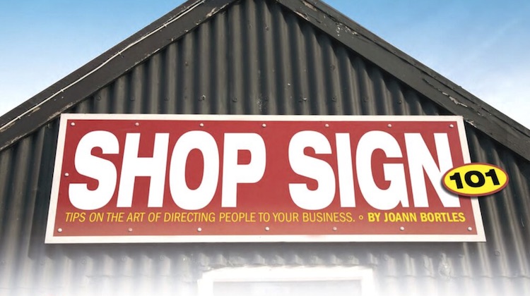
Whether you’re in the market for a new sign or worried that you’re existing one may not be ideal, check out the article “Shop Sign 101” in The Shop magazine.
The article, written by a sign expert, is full of tips on how to get the most from your shop sign — including, the “45 mph rule.”
One of the biggest mistakes is shop signs with fine details that are hard to see. […]
Maybe you have a complex logo. That might need to be simplified. And sometimes, your artistic pride might have to take a backseat to the needs of your customers. […]
The most common mistakes are trying to cram in too much information, complex backgrounds (like a photo of your work), fancy fonts and/or lettering that is way too small.
Think about it as the 45-mph rule. If someone cannot clearly see what’s on your sign at 45 mph, then it’s kind of a waste.
To read the full article, check out the March 2017 issue of The Shop by clicking here.
For more business tips, check out The Hog Ring’s “Better Business” section.

Word of mouth will beat any sign . Let your work be your sign . My work will Out shine any sign
True. But combine word of mouth with a good shop sign and you’re golden.
A business with no sign, is a sign of no business,
A word of mouth become after the sign
I own a sign shop and see it every day people come to me with these graphic that must of took a week to do . Then say they want it all to fit on a 2×3 sign. Hmmmm i say sorry not interested in the job. Because i know they will be mad that it looks like all one color at 45mph.